Hi all, This Blog is an English archive of my PhD experience in Imperial College London, mainly logging my research and working process, as well as some visual records.

Tuesday 23 October 2007

Algebra - Imperial College

M2P2 Algebra

Lecturer: Prof M W Liebeck


Recommended books

For group theory, there are many good introductory books. Here are a few suggestions:

J.B. Fraleigh, A First Course in Abstract Algebra, Addison Wesley

R.. Allenby, Rings, Fields and Groups, Arnold

I.N. Herstein, Topics in Algebra

For linear algebra, here are a few good ones:

J. Fraleigh and R. Beauregard, Linear Algebra, Addison Wesley

S. Lipschutz and M. Lipson, Linear Algebra, Schaum Outline Series, McGraw Hill

M2S1 PROBABILITY AND STATISTICS II - Imperial College

Recommended Texts
G. R. Grimmett and D. R. Stirzaker, Probability and Random Processes (2nd Edition/3rd Edition).
[Very useful for probability material of the course].
W. Feller, An Introduction to Probability Theory and Its Applications. Vols 1 and 2. [A classical
reference text].
G. Casella and R.L. Berger, Statistical Inference. [A very useful text, which covers statistical ideas as
well as probability material].
There are many such introductory texts in the Mathematics library. Other books relating to specific
parts of the course will be recommended when relevant.
Also, there will be a course WWW page accessible from http://stats.ma.ic.ac.uk/ayoung. It will
contain links to course handouts, exercises and solutions.
Professor A. Young (room 529, email alastair.young@imperial.ac.uk)

Friday 19 October 2007

Confusion Matrix

A confusion matrix (Kohavi and Provost, 1998) contains information about actual and predicted classifications done by a classification system. Performance of such systems is commonly evaluated using the data in the matrix. The following table shows the confusion matrix for a two class classifier.

The entries in the confusion matrix have the following meaning in the context of our study:

  • a is the number of correct predictions that an instance is negative,
  • b is the number of incorrect predictions that an instance is positive,
  • c is the number of incorrect of predictions that an instance negative, and
  • d is the number of correct predictions that an instance is positive.


Predicted


Negative Positive
Actual Negative a b
Positive
c
d

Several standard terms have been defined for the 2 class matrix:

  • The accuracy (AC) is the proportion of the total number of predictions that were correct. It is determined using the equation:
[1]
  • The recall or hit rate or true positive rate (TP) is the proportion of positive cases that were correctly identified, as calculated using the equation:
[2]
  • The false alarm rate or false positive rate (FP) is the proportion of negatives cases that were incorrectly classified as positive, as calculated using the equation:
[3]
  • The true negative rate (TN) is defined as the proportion of negatives cases that were classified correctly, as calculated using the equation:
[4]
  • The false negative rate (FN) is the proportion of positives cases that were incorrectly classified as negative, as calculated using the equation:
[5]
  • Finally, precision (P) is the proportion of the predicted positive cases that were correct, as calculated using the equation:
[6]

The accuracy determined using equation 1 may not be an adequate performance measure when the number of negative cases is much greater than the number of positive cases (Kubat et al., 1998). Suppose there are 1000 cases, 995 of which are negative cases and 5 of which are positive cases. If the system classifies them all as negative, the accuracy would be 99.5%, even though the classifier missed all positive cases. Other performance measures account for this by including TP in a product: for example, geometric mean (g-mean) (Kubat et al., 1998), as defined in equations 7 and 8, and F-Measure (Lewis and Gale, 1994), as defined in equation 9.

[7]

[8]

[9]

In equation 9, b has a value from 0 to infinity and is used to control the weight assigned to TP and P. Any classifier evaluated using equations 7, 8 or 9 will have a measure value of 0, if all positive cases are classified incorrectly.

Another way to examine the performance of classifiers is to use a ROC graph, described on the next page.

Timetable II

Autumn 2007

MSc Advanced Computing (Weeks 2 - 11)

Week 2 start date: Monday 8 October, 2007

Date Published: 19 October 2007

Time Monday Tuesday Wednesday Thursday Friday
0900 Advanced Topics in Software Engineering
LEC (2-10) / jnm (2-10),sue (2-10) / 311
Modal and Temporal Logic
LEC (2-10) / imh (2-10),mjs (2-10) / 144
Commemoration Day (No Teaching Week 4 - 24.10.07)
Wks (4-4) / None (4-4) /

Intelligent Data and Probabilistic Inference
LEC (2-10) / dfg (2-10) / 145
Advanced Issues in Object Oriented Programming
LEC (2-10) / scd (2-10) / 145
Network Security
LEC (2-10) / ecl1 (2-10),mrh (2-10) / 308
1000 Advanced Topics in Software Engineering
TUT (2-10) / jnm (2-10),sue (2-10) / 311

Laboratory Prolog
LAB (2-10) / nr600 (2-10) / 202,206

Intelligent Data and Probabilistic Inference
LEC (11-11) / dfg (11-11) / 308
Modal and Temporal Logic
TUT (2-10) / imh (2-10),mjs (2-10) / 144
Commemoration Day (No Teaching Week 4 - 24.10.07)
Wks (4-4) / None (4-4) /

Intelligent Data and Probabilistic Inference
LEC (2-10) / dfg (2-10) / 308
Advanced Issues in Object Oriented Programming
TUT (2-10) / scd (2-10) / 145
Lexus Preperation
Wks (11-11) / nr600 (11-11) / 202,206

Network Security
TUT (2-10) / ecl1 (2-10),mrh (2-10) / 308
1100 Laboratory Prolog
LAB (2-10) / nr600 (2-10) / 202,206

Advanced Topics in Software Engineering
LEC (2-10) / jnm (2-10),sue (2-10) / 311

Intelligent Data and Probabilistic Inference
LEC (11-11) / dfg (11-11) / 308

Lexus Preperation
Wks (5-5) / nr600 (5-5) / 202,206
Models of Concurrent Computation
LEC (2-10) / dirk (2-10),pg (2-10) / 145
Commemoration Day (No Teaching Week 4 - 24.10.07)
Wks (4-4) / None (4-4) /

Laboratory Prolog
LAB (2-10) / nr600 (2-10) / 202,206

Intelligent Data and Probabilistic Inference
TUT (2-10) / dfg (2-10) / 344
Machine Learning
LAB (2-10) / maja (2-10),shm (2-10) / 219

Computing for Optimal Decisions
LEC (2-10) / br (2-10) / 145
Machine Learning
LAB (2-10) / maja (2-10),shm (2-10) / 219

Lexis Prolog
LAB (11-11) / nr600 (11-11) / 202,206

Modal and Temporal Logic
LEC (2-10) / imh (2-10),mjs (2-10) / 144
1200 Laboratory Workshop (MAC & MSc CS in depth pathway)
LEC (2-11) / nr600 (2-11) / 311

Lexis Prolog
LAB (5-5) / nr600 (5-5) / 202,206

Intelligent Data and Probabilistic Inference
TUT (11-11) / dfg (11-11) / 308
Prolog Support Lectures
LEC (2-10) / cjh (2-10),klc (2-10) / 144
Commemoration Day (No Teaching Week 4 - 24.10.07)
Wks (4-4) / None (4-4) /

Laboratory Prolog
LAB (2-10) / nr600 (2-10) / 202,206
Machine Learning Alternative Lab
LAB (2-10) / maja (2-10),shm (2-10) / 219
Machine Learning Alternative Lab
LAB (2-10) / maja (2-10),shm (2-10) / 219

Lexis Prolog
LAB (11-11) / nr600 (11-11) / 202,206
1300 Lexis Prolog
LAB (5-5) / nr600 (5-5) / 202,206


1400 Advanced Issues in Object Oriented Programming
LEC (2-10) / scd (2-10) / 144
Network Security
LEC (2-10) / ecl1 (2-10),mrh (2-10) / 144

Automated Reasoning
LEC (2-10) / kb (2-10) / 145
Automated Reasoning
LEC (2-10) / kb (2-10) / 144
1500
Models of Concurrent Computation
TUT (2-10) / dirk (2-10),pg (2-10) / 145

Computer Vision
LEC (2-10) / gzy (2-10) / 144
Automated Reasoning
TUT (2-10) / kb (2-10) / 144
1600 Machine Learning
LEC (2-10) / maja (2-10),shm (2-10) / 311
Models of Concurrent Computation
LEC (2-10) / dirk (2-10),pg (2-10) / 145

Computer Vision
TUT (2-10) / gzy (2-10) / 144
Computing for Optimal Decisions
LEC (2-10) / br (2-10) / 145
1700 Machine Learning
LEC (2-10) / maja (2-10),shm (2-10) / 311
Project Lecture
LEC (8-8) / / 308

Computer Vision
LEC (2-10) / gzy (2-10) / 144
Computing for Optimal Decisions
TUT (2-10) / br (2-10) / 145

Timetable

Autumn 2007

MSc Computing Science (Weeks 2 - 11)

Week 2 start date: Monday 8 October, 2007

Date Published: 19 October 2007

Time Monday Tuesday Wednesday Thursday Friday
0900
Programming in C and C++
LEC (2-2) / wjk (2-2) / 311
Commemoration Day (No Teaching Week 4 - 24.10.07)
Wks (4-4) / None (4-4) /

Integrated Programming Laboratory
LAB (2-10) / ap7 (2-10) / 202,206

Programming in C and C++
LEC (2-2) / wjk (2-2) / 144
Programming in C and C++
LEC (2-2) / wjk (2-2) / 308

1000 Computer Systems
LEC (3-11) / dirk (3-11),jamm (3-11) / 145
Integrated Programming Laboratory
LAB (2-2) / ap7 (2-2) / 202

Object Oriented Design & Programming.
LEC (3-11) / scd (3-11),wjk (3-11) / 343
Integrated Programming Laboratory
LAB (2-10) / ap7 (2-10) / 202

Commemoration Day (No Teaching Week 4 - 24.10.07)
Wks (4-4) / None (4-4) /
Integrated Programming Laboratory
LAB (2-2) / ap7 (2-2) / 206
Programming in C and C++
LEC (2-2) / wjk (2-2) / 144

Object Oriented Design & Programming.
LEC (3-11) / scd (3-11),wjk (3-11) / 343
1100 Computer Systems
TUT (3-11) / dirk (3-11),jamm (3-11) / 144
Integrated Programming Laboratory
LAB (2-2) / ap7 (2-2) / 202

Logic and AI Programming
LEC (6-8) / klc (6-8) / 343
Integrated Programming Laboratory
LAB (2-10) / ap7 (2-10) / 202

Commemoration Day (No Teaching Week 4 - 24.10.07)
Wks (4-4) / None (4-4) /
Computer Systems
LEC (3-9) / ajd (3-9) / 144

Integrated Programming Laboratory
LAB (2-2) / ap7 (2-2) / 202,206
Object Oriented Design & Programming.
TUT (3-11) / scd (3-11),wjk (3-11) / 343

Integrated Programming Laboratory
LAB (1-2) / ap7 (1-2) / 202,206
1200 Computer Systems
LEC (3-11) / dirk (3-11),jamm (3-11) / 145
Programming in C and C++
LEC (2-2) / wjk (2-2) / 311

Logic and AI Programming
TUT (6-8) / klc (6-8) / 343,202,206
Integrated Programming Laboratory
LAB (2-10) / ap7 (2-10) / 202,206

Commemoration Day (No Teaching Week 4 - 24.10.07)
Wks (4-4) / None (4-4) /
Programming in C and C++
LEC (2-2) / wjk (2-2) / 308

Computer Systems
TUT (3-9) / ajd (3-9) / 144,202,206
Computer Systems
LEC (3-9) / ajd (3-9) / 144

Programming in C and C++
TUT (2-2) / wjk (2-2) / 308

Integrated Programming Laboratory
LAB (2-2) / ap7 (2-2) / 202,206
1300


1400 Logic and AI Programming
LEC (3-11) / fs (3-11),klc (3-11) / 145

Programming in C and C++
LEC (2-2) / wjk (2-2) / 145
Logic and AI Programming
LEC (3-11) / fs (3-11),klc (3-11) / 343

Programming in C and C++
TUT (2-2) / wjk (2-2) / 344

Programming in C and C++
LEC (2-2) / wjk (2-2) / 144

Computer Systems
LEC (3-9) / ajd (3-9) / 144
Programming in C and C++
TUT (2-2) / wjk (2-2) / 344
1500 Programming in C and C++
LEC (2-2) / wjk (2-2) / 145

Logic and AI Programming
LEC (6-8) / klc (6-8) / 145
Logic and AI Programming
TUT (3-11) / fs (3-11),klc (3-11) / 343

Logic and AI Programming
LAB (9-10) / klc (9-10) / 202,206

Integrated Programming Laboratory
LAB (2-2) / ap7 (2-2) / 206

Integrated Programming Laboratory
LAB (2-2) / ap7 (2-2) / 202
Integrated Programming Laboratory
LAB (2-2) / ap7 (2-2) / 202
1600 Integrated Programming Laboratory
LAB (2-2) / ap7 (2-2) / 202,206
Integrated Programming Laboratory
LAB (2-2) / ap7 (2-2) / 202,206

Lab Workshop (MSc CS)
LAB (3-10) / ap7 (3-10) / 202,206

Integrated Programming Laboratory
LAB (7-11) / ap7 (7-11) / 202

Integrated Programming Laboratory
LAB (2-4) / ap7 (2-4) / 202
MSc in Computing Group Project Presentations
Wks (8-8) / ap7 (8-8) / 308

Integrated Programming Laboratory
LAB (2-2) / ap7 (2-2) / 202
1700 Integrated Programming Laboratory
LAB (2-2) / ap7 (2-2) / 202,206
Integrated Programming Laboratory
LAB (2-2) / ap7 (2-2) / 202,206

Integrated Programming Laboratory
LAB (2-4) / ap7 (2-4) / 202,206
MSc in Computing Group Project Presentations
Wks (8-8) / ap7 (8-8) / 308

ROC Graph

ROC graphs are another way besides confusion matrices to examine the performance of classifiers (Swets, 1988). A ROC graph is a plot with the false positive rate on the X axis and the true positive rate on the Y axis. The point (0,1) is the perfect classifier: it classifies all positive cases and negative cases correctly. It is (0,1) because the false positive rate is 0 (none), and the true positive rate is 1 (all). The point (0,0) represents a classifier that predicts all cases to be negative, while the point (1,1) corresponds to a classifier that predicts every case to be positive. Point (1,0) is the classifier that is incorrect for all classifications. In many cases, a classifier has a parameter that can be adjusted to increase TP at the cost of an increased FP or decrease FP at the cost of a decrease in TP. Each parameter setting provides a (FP, TP) pair and a series of such pairs can be used to plot an ROC curve. A non-parametric classifier is represented by a single ROC point, corresponding to its (FP,TP) pair.

The above figure shows an example of an ROC graph with two ROC curves labeled C1 and C2, and two ROC points labeled P1 and P2. Non-parametric algorithms produce a single ROC point for a particular data set.

Features of ROC Graphs

  • An ROC curve or point is independent of class distribution or error costs (Provost et al., 1998).
  • An ROC graph encapsulates all information contained in the confusion matrix, since FN is the complement of TP and TN is the complement of FP (Swets, 1988).
  • ROC curves provide a visual tool for examining the tradeoff between the ability of a classifier to correctly identify positive cases and the number of negative cases that are incorrectly classified.
  • The closer the curve follows the left-hand border and then the top border of the ROC space, the more accurate the test.The closer the curve comes to the 45-degree diagonal of the ROC space, the less accurate the test.


Area-based Accuracy Measure

It has been suggested that the area beneath an ROC curve can be used as a measure of accuracy in many applications (Swets, 1988). Provost and Fawcett (1997) argue that using classification accuracy to compare classifiers is not adequate unless cost and class distributions are completely unknown and a single classifier must be chosen to handle any situation. They propose a method of evaluating classifiers using a ROC graph and imprecise cost and class distribution information.

Euclidian Distance Comparison

Another way of comparing ROC points is by using an equation that equates accuracy with the Euclidian distance from the perfect classifier, point (0,1) on the graph. We include a weight factor that allows us to define relative misclassification costs, if such information is available. We define ACd as a distance based performance measure for an ROC point and calculate it using the equation:

[22]

where W is a factor, ranging from 0 to 1, that is used to assign relative importance to false positives and false negatives. ACd ranges from 0 for the perfect classifier to sqrt(2) for a classifier that classifies all cases incorrectly, point (1,0) on the ROC graph. ACd differs from g-mean1, g-mean2 and F-measure in that it is equal to zero only if all cases are classified correctly. In other words, a classifier evaluated using ACd gets some credit for correct classification of negative cases, regardless of its accuracy in correctly identifying positive cases.

Example

Consider two algorithms A and B that perform adequately against most data sets. However, assume both A and B misclassify all positive cases in a particular data set and A classifies 10 times the number of infrequent itemsets as potentially frequent compared to B. Algorithm B is the better algorithm in this case because there has been less wasted effort counting infrequent itemsets.

Cumulative Gains and Lift Charts

  • Lift is a measure of the effectiveness of a predictive model calculated as the ratio between the results obtained with and without the predictive model.
  • Cumulative gains and lift charts are visual aids for measuring model performance
  • Both charts consist of a lift curve and a baseline
  • The greater the area between the lift curve and the baseline, the better the model

Example Problem 1

A company wants to do a mail marketing campaign. It costs the company $1 for each item mailed. They have information on 100,000 customers. Create a cumulative gains and a lift chart from the following data.
  • Overall Response Rate: If we assume we have no model other than the prediction of the overall response rate, then we can predict the number of positive responses as a fraction of the total customers contacted. Suppose the response rate is 20%. If all 100,000 customers are contacted we will receive around 20,000 positive responses.
Cost ($) Total Customers Contacted Positive Responses
100000
100000
20000
  • Prediction of Response Model: A response model predicts who will respond to a marketing campaign. If we have a response model, we can make more detailed predictions. For example, we use the response model to assign a score to all 100,000 customers and predict the results of contacting only the top 10,000 customers, the top 20,000 customers, etc.
Cost ($) Total Customers Contacted Positive Responses
10000
10000
6000
20000
20000
10000
30000
30000
13000
40000
40000
15800
50000
50000
17000
60000
60000
18000
70000
70000
18800
80000
80000
19400
90000
90000
19800
100000
100000
20000

Cumulative Gains Chart:

  • The y-axis shows the percentage of positive responses. This is a percentage of the total possible positive responses (20,000 as the overall response rate shows).
  • The x-axis shows the percentage of customers contacted, which is a fraction of the 100,000 total customers.
  • Baseline (overall response rate): If we contact X% of customers then we will receive X% of the total positive responses.
  • Lift Curve: Using the predictions of the response model, calculate the percentage of positive responses for the percent of customers contacted and map these points to create the lift curve.


Lift Chart:

  • Shows the actual lift.
  • To plot the chart: Calculate the points on the lift curve by determining the ratio between the result predicted by our model and the result using no model.
  • Example: For contacting 10% of customers, using no model we should get 10% of responders and using the given model we should get 30% of responders. The y-value of the lift curve at 10% is 30 / 10 = 3.


Analyzing the Charts: Cumulative gains and lift charts are a graphical representation of the advantage of using a predictive model to choose which customers to contact. The lift chart shows how much more likely we are to receive respondents than if we contact a random sample of customers. For example, by contacting only 10% of customers based on the predictive model we will reach 3 times as many respondents as if we use no model.

Evaluating a Predictive Model

We can assess the value of a predictive model by using the model to score a set of customers and then contacting them in this order. The actual response rates are recorded for each cutoff point, such as the first 10% contacted, the first 20% contacted, etc. We create cumulative gains and lift charts using the actual response rates to see how much the predictive model would have helped in this situation. The information can be used to determine whether we should use this model or one similar to it in the future.

Example Problem 2

Using the response model P(x)=100-AGE(x) for customer x and the data table shown below, construct the cumulative gains and lift charts. Ties in ranking should be arbitrarily broken by assigning a higher rank to who appears first in the table.
Customer Name
Height
Age
Actual Response
Alan
70
39
N
Bob
72
21
Y
Jessica
65
25
Y
Elizabeth
62
30
Y
Hilary
67
19
Y
Fred
69
48
N
Alex
65
12
Y
Margot
63
51
N
Sean
71
65
Y
Chris
73
42
N
Philip
75
20
Y
Catherine
70
23
N
Amy
69
13
N
Erin
68
35
Y
Trent
72
55
N
Preston
68
25
N
John
64
76
N
Nancy
64
24
Y
Kim
72
31
N
Laura
62
29
Y

1. Calculate P(x) for each person x

2. Order the people according to rank P(x)

Customer Name P(x) Actual Response
Alex 88 Y
Amy 87 N
Hilary 81 Y
Philip 80 Y
Bob 79 Y
Catherine 77 N
Nancy 76 Y
Jessica 75 Y
Preston 75 N
Laura 71 Y
Elizabeth 70 Y
Kim 69 N
Erin 65 Y
Alan 61 N
Chris 58 N
Fred 52 N
Margot 49 N
Trent 45 N
Sean 35 Y
John 24 N
3. Calculate the percentage of total responses for each cutoff point
  • Response Rate = Number of Responses / Total Number of Responses (10)
Total Customers Contacted
Number of Responses
Response Rate
2
1
10%
4
3
30%
6
4
40%
8
6
60%
10
7
70%
12
8
80%
14
9
90%
16
9
90%
18
9
90%
20
10
100%
4. Create the cumulative gains chart:
  • The lift curve and the baseline have the same values for 10%-20% and 90%-100%.
5. Create the lift chart:

Introduction to ROC Curves

About ROC curves

A ROC curve provides a graphical representation of the relationship between the true-positive and false-positive prediction rate of a model. The y-axis corresponds to the sensitivity of the model, i.e. how well the model is able to predict true positives (real cleavages) from sites that are not cleaved, and the y-coordinates are calculated as:

Calculation of sensitivity.

The x-axis corresponds to the specificity (expressed on the curve as 1-specificity), i.e. the ability of the model to identify true negatives. An increase in specificity (i.e. a decrease along the X-axis) results in an increase in sensitivity. The x-coordinates are calculated as:

Calculation of specificity.

The greater the sensitivity at high specificity values (i.e. high y-axis values at low X-axis values) the better the model. A numerical measure of the accuracy of the model can be obtained from the area under the curve, where an area of 1.0 signifies near perfect accuracy, while an area of less than 0.5 indicates that the model is worse than just random. The quantitative-qualitative relationship between area and accuracy follows a fairly linear pattern, such that the following could be used as a guide:

  • 0.9-1: Excellent
  • 0.8-0.9: Very good
  • 0.7-0.8: Good
  • 0.6-0.7: Average
  • 0.5-0.6: Poor


Introduction to ROC Curves


The sensitivity and specificity of a diagnostic test depends on more than just the "quality" of the test--they also depend on the definition of what constitutes an abnormal test. Look at the the idealized graph at right showing the number of patients with and without a disease arranged according to the value of a diagnostic test. This distributions overlap--the test (like most) does not distinguish normal from disease with 100% accuracy. The area of overlap indicates where the test cannot distinguish normal from disease. In practice, we choose a cutpoint (indicated by the vertical black line) above which we consider the test to be abnormal and below which we consider the test to be normal. The position of the cutpoint will determine the number of true positive, true negatives, false positives and false negatives. We may wish to use different cutpoints for different clinical situations if we wish to minimize one of the erroneous types of test results.

We can use the hypothyroidism data from the likelihood ratio section to illustrate how sensitivity and specificity change depending on the choice of T4 level that defines hypothyroidism. Recall the data on patients with suspected hypothyroidism reported by Goldstein and Mushlin (J Gen Intern Med 1987;2:20-24.). The data on T4 values in hypothyroid and euthyroid patients are shown graphically (below left) and in a simplified tabular form (below right).

T4 value Hypothyroid Euthyroid
5 or less 18 1
5.1 - 7 7 17
7.1 - 9 4 36
9 or more 3 39
Totals: 32 93


Suppose that patients with T4 values of 5 or less are considered to be hypothyroid. The data display then reduces to:

T4 value Hypothyroid Euthyroid
5 or less 18 1
> 5 14 92
Totals: 32 93
You should be able to verify that the sensivity is 0.56 and the specificity is 0.99.

Now, suppose we decide to make the definition of hypothyroidism less stringent and now consider patients with T4 values of 7 or less to be hypothyroid. The data display will now look like this:

T4 value Hypothyroid Euthyroid
7 or less 25 18
> 7 7 75
Totals: 32 93
You should be able to verify that the sensivity is 0.78 and the specificity is 0.81.

Lets move the cut point for hypothyroidism one more time:
T4 value Hypothyroid Euthyroid
<> 29 54
9 or more 3 39
Totals: 32 93
You should be able to verify that the sensivity is 0.91 and the specificity is 0.42.

Now, take the sensitivity and specificity values above and put them into a table:
Cutpoint Sensitivity Specificity
5 0.56 0.99
7 0.78 0.81
9 0.91 0.42
Notice that you can improve the sensitivity by moving to cutpoint to a higher T4 value--that is, you can make the criterion for a positive test less strict. You can improve the specificity by moving the cutpoint to a lower T4 value--that is, you can make the criterion for a positive test more strict. Thus, there is a tradeoff between sensitivity and specificity. You can change the definition of a positive test to improve one but the other will decline.

The next section covers how to use the numbers we just calculated to draw and interpret an ROC curve.
.


|


Plotting and Intrepretating an ROC Curve


This section continues the hypothyroidism example started in the the previous section. We showed that the table at left can be summarized by the operating characteristics at right:
T4 value Hypothyroid Euthyroid
5 or less 18 1
5.1 - 7 7 17
7.1 - 9 4 36
9 or more 3 39
Totals: 32 93
Cutpoint Sensitivity Specificity
5 0.56 0.99
7 0.78 0.81
9 0.91 0.42

The operating characteristics (above right) can be reformulated slightly and then presented graphically as shown below to the right:

Cutpoint True Positives False Positives
5 0.56 0.01
7 0.78 0.19
9 0.91 0.58

This type of graph is called a Receiver Operating Characteristic curve (or ROC curve.) It is a plot of the true positive rate against the false positive rate for the different possible cutpoints of a diagnostic test.

An ROC curve demonstrates several things:

  1. It shows the tradeoff between sensitivity and specificity (any increase in sensitivity will be accompanied by a decrease in specificity).
  2. The closer the curve follows the left-hand border and then the top border of the ROC space, the more accurate the test.
  3. The closer the curve comes to the 45-degree diagonal of the ROC space, the less accurate the test.
  4. The slope of the tangent line at a cutpoint gives the likelihood ratio (LR) for that value of the test. You can check this out on the graph above. Recall that the LR for T4 <> 9 is 0.2. This corresponds to the far right, nearly horizontal portion of the curve.
  5. The area under the curve is a measure of text accuracy. This is discussed further in the next section.

.

The Area Under an ROC Curve

| Previous Section | Main Menu | Next Section |

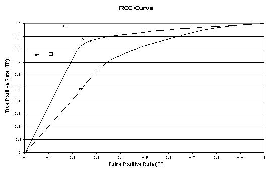
The graph at right shows three ROC curves representing excellent, good, and worthless tests plotted on the same graph. The accuracy of the test depends on how well the test separates the group being tested into those with and without the disease in question. Accuracy is measured by the area under the ROC curve. An area of 1 represents a perfect test; an area of .5 represents a worthless test. A rough guide for classifying the accuracy of a diagnostic test is the traditional academic point system:

  • .90-1 = excellent (A)
  • .80-.90 = good (B)
  • .70-.80 = fair (C)
  • .60-.70 = poor (D)
  • .50-.60 = fail (F)
Recall the T4 data from the previous section. The area under the T4 ROC curve is .86. The T4 would be considered to be "good" at separating hypothyroid from euthyroid patients.

ROC curves can also be constructed from clinical prediction rules. The graphs at right come from a study of how clinical findings predict strep throat (Wigton RS, Connor JL, Centor RM. Transportability of a decision rule for the diagnosis of streptococcal pharyngitis. Arch Intern Med. 1986;146:81-83.) In that study, the presence of tonsillar exudate, fever, adenopathy and the absence of cough all predicted strep. The curves were constructed by computing the sensitivity and specificity of increasing numbers of clinical findings (from 0 to 4) in predicting strep. The study compared patients in Virginia and Nebraska and found that the rule performed more accurately in Virginia (area under the curve = .78) compared to Nebraska (area under the curve = .73). These differences turn out not to be statistically different, however.

At this point, you may be wondering what this area number really means and how it is computed. The area measures discrimination, that is, the ability of the test to correctly classify those with and without the disease. Consider the situation in which patients are already correctly classified into two groups. You randomly pick on from the disease group and one from the no-disease group and do the test on both. The patient with the more abnormal test result should be the one from the disease group. The area under the curve is the percentage of randomly drawn pairs for which this is true (that is, the test correctly classifies the two patients in the random pair).

Computing the area is more difficult to explain and beyond the scope of this introductory material. Two methods are commonly used: a non-parametric method based on constructing trapeziods under the curve as an approximation of area and a parametric method using a maximum likelihood estimator to fit a smooth curve to the data points. Both methods are available as computer programs and give an estimate of area and standard error that can be used to compare different tests or the same test in different patient populations. For more on quantitative ROC analysis, see Metz CE. Basic principles of ROC analysis. Sem Nuc Med. 1978;8:283-298.

A final note of historical interest
You may be wondering where the name "Reciever Operating Characteristic" came from. ROC analysis is part of a field called "Signal Dectection Therory" developed during World War II for the analysis of radar images. Radar operators had to decide whether a blip on the screen represented an enemy target, a friendly ship, or just noise. Signal detection theory measures the ability of radar receiver operators to make these important distinctions. Their ability to do so was called the Receiver Operating Characteristics. It was not until the 1970's that signal detection theory was recognized as useful for interpreting medical test results.

Logistic Regression

Logistic Regression

What is the logistic curve? What is the base of the natural logarithm? Why do statisticians prefer logistic regression to ordinary linear regression when the DV is binary? How are probabilities, odds and logits related? What is an odds ratio? How can logistic regression be considered a linear regression? What is a loss function? What is a maximum likelihood estimate? How is the b weight in logistic regression for a categorical variable related to the odds ratio of its constituent categories?

This chapter is difficult because there are many new concepts in it. Studying this may bring back feelings that you had in the first third of the course, when there were many new concepts each week.

For this chapter only, we are going to deal with a dependent variable that is binary (a categorical variable that has two values such as "yes" and "no") rather than continuous.

[Technical note: Logistic regression can also be applied to ordered categories (ordinal data), that is, variables with more than two ordered categories, such as what you find in many surveys. However, we won't be dealing with that in this course and you probably will never be taught it. If our dependent variable has several unordered categories (e.g., suppose our DV was state of origin in the U.S.), then we can use something called discriminant analysis, which will be taught to you in a course on multivariate statistics.]

It is customary to code a binary DV either 0 or 1. For example, we might code a successfully kicked field goal as 1 and a missed field goal as 0 or we might code yes as 1 and no as 0 or admitted as 1 and rejected as 0 or Cherry Garcia flavor ice cream as 1 and all other flavors as zero. If we code like this, then the mean of the distribution is equal to the proportion of 1s in the distribution. For example if there are 100 people in the distribution and 30 of them are coded 1, then the mean of the distribution is .30, which is the proportion of 1s. The mean of the distribution is also the probability of drawing a person labeled as 1 at random from the distribution. That is, if we grab a person at random from our sample of 100 that I just described, the probability that the person will be a 1 is .30. Therefore, proportion and probability of 1 are the same in such cases. The mean of a binary distribution so coded is denoted as P, the proportion of 1s. The proportion of zeros is (1-P), which is sometimes denoted as Q. The variance of such a distribution is PQ, and the standard deviation is Sqrt(PQ). {Why can't all of stats be this easy?}

Suppose we want to predict whether someone is male or female (DV, M=1, F=0) using height in inches (IV). We could plot the relations between the two variables as we customarily do in regression. The plot might look something like this:

Points to notice about the graph (data are fictional):

  1. The regression line is a rolling average, just as in linear regression. The Y-axis is P, which indicates the proportion of 1s at any given value of height. (review graph)
  2. The regression line is nonlinear. (review graph)
  3. None of the observations --the raw data points-- actually fall on the regression line. They all fall on zero or one. (review graph)

Why use logistic regression rather than ordinary linear regression?

When I was in graduate school, people didn't use logistic regression with a binary DV. They just used ordinary linear regression instead. Statisticians won the day, however, and now most psychologists use logistic regression with a binary DV for the following reasons:

  1. If you use linear regression, the predicted values will become greater than one and less than zero if you move far enough on the X-axis. Such values are theoretically inadmissible.
  2. One of the assumptions of regression is that the variance of Y is constant across values of X (homoscedasticity). This cannot be the case with a binary variable, because the variance is PQ. When 50 percent of the people are 1s, then the variance is .25, its maximum value. As we move to more extreme values, the variance decreases. When P=.10, the variance is .1*.9 = .09, so as P approaches 1 or zero, the variance approaches zero.
  3. The significance testing of the b weights rest upon the assumption that errors of prediction (Y-Y') are normally distributed. Because Y only takes the values 0 and 1, this assumption is pretty hard to justify, even approximately. Therefore, the tests of the regression weights are suspect if you use linear regression with a binary DV.

The Logistic Curve

The logistic curve relates the independent variable, X, to the rolling mean of the DV, P (). The formula to do so may be written either

Or

where P is the probability of a 1 (the proportion of 1s, the mean of Y), e is the base of the natural logarithm (about 2.718) and a and b are the parameters of the model. The value of a yields P when X is zero, and b adjusts how quickly the probability changes with changing X a single unit (we can have standardized and unstandardized b weights in logistic regression, just as in ordinary linear regression). Because the relation between X and P is nonlinear, b does not have a straightforward interpretation in this model as it does in ordinary linear regression.

Loss Function

A loss function is a measure of fit between a mathematical model of data and the actual data. We choose the parameters of our model to minimize the badness-of-fit or to maximize the goodness-of-fit of the model to the data. With least squares (the only loss function we have used thus far), we minimize SSres, the sum of squares residual. This also happens to maximize SSreg, the sum of squares due to regression. With linear or curvilinear models, there is a mathematical solution to the problem that will minimize the sum of squares, that is,

b = (X'X)-1X'y

Or

b = R-1r

With some models, like the logistic curve, there is no mathematical solution that will produce least squares estimates of the parameters. For many of these models, the loss function chosen is called maximum likelihood. A likelihood is a conditional probability (e.g., P(Y|X), the probability of Y given X). We can pick the parameters of the model (a and b of the logistic curve) at random or by trial-and-error and then compute the likelihood of the data given those parameters (actually, we do better than trail-and-error, but not perfectly). We will choose as our parameters, those that result in the greatest likelihood computed. The estimates are called maximum likelihood because the parameters are chosen to maximize the likelihood (conditional probability of the data given parameter estimates) of the sample data. The techniques actually employed to find the maximum likelihood estimates fall under the general label numerical analysis. There are several methods of numerical analysis, but they all follow a similar series of steps. First, the computer picks some initial estimates of the parameters. Then it will compute the likelihood of the data given these parameter estimates. Then it will improve the parameter estimates slightly and recalculate the likelihood of the data. It will do this forever until we tell it to stop, which we usually do when the parameter estimates do not change much (usually a change .01 or .001 is small enough to tell the computer to stop). [Sometimes we tell the computer to stop after a certain number of tries or iterations, e.g., 20 or 250. This usually indicates a problem in estimation.]

Where on Earth Did This Stuff Come From?

Suppose we only know a person's height and we want to predict whether that person is male or female. We can talk about the probability of being male or female, or we can talk about the odds of being male or female. Let's say that the probability of being male at a given height is .90. Then the odds of being male would be

.

(Odds can also be found by counting the number of people in each group and dividing one number by the other. Clearly, the probability is not the same as the odds.) In our example, the odds would be .90/.10 or 9 to one. Now the odds of being female would be .10/.90 or 1/9 or .11. This asymmetry is unappealing, because the odds of being a male should be the opposite of the odds of being a female. We can take care of this asymmetry though the natural logarithm, ln. The natural log of 9 is 2.217 (ln(.9/.1)=2.217). The natural log of 1/9 is -2.217 (ln(.1/.9)=-2.217), so the log odds of being male is exactly opposite to the log odds of being female. The natural log function looks like this:

Note that the natural log is zero when X is 1. When X is larger than one, the log curves up slowly. When X is less than one, the natural log is less than zero, and decreases rapidly as X approaches zero. When P = .50, the odds are .50/.50 or 1, and ln(1) =0. If P is greater than .50, ln(P/(1-P) is positive; if P is less than .50, ln(odds) is negative. [A number taken to a negative power is one divided by that number, e.g. e-10 = 1/e10. A logarithm is an exponent from a given base, for example ln(e10) = 10.]

Back to logistic regression.

In logistic regression, the dependent variable is a logit, which is the natural log of the odds, that is,

So a logit is a log of odds and odds are a function of P, the probability of a 1. In logistic regression, we find

logit(P) = a + bX,

Which is assumed to be linear, that is, the log odds (logit) is assumed to be linearly related to X, our IV. So there's an ordinary regression hidden in there. We could in theory do ordinary regression with logits as our DV, but of course, we don't have logits in there, we have 1s and 0s. Then, too, people have a hard time understanding logits. We could talk about odds instead. Of course, people like to talk about probabilities more than odds. To get there (from logits to probabilities), we first have to take the log out of both sides of the equation. Then we have to convert odds to a simple probability:

The simple probability is this ugly equation that you saw earlier. If log odds are linearly related to X, then the relation between X and P is nonlinear, and has the form of the S-shaped curve you saw in the graph and the function form (equation) shown immediately above.

An Example

Suppose that we are working with some doctors on heart attack patients. The dependent variable is whether the patient has had a second heart attack within 1 year (yes = 1). We have two independent variables, one is whether the patient completed a treatment consistent of anger control practices (yes=1). The other IV is a score on a trait anxiety scale (a higher score means more anxious).

Our data:

Person

2nd Heart Attack

Treatment of Anger

Trait Anxiety

1

1

1

70

2

1

1

80

3

1

1

50

4

1

0

60

5

1

0

40

6

1

0

65

7

1

0

75

8

1

0

80

9

1

0

70

10

1

0

60

11

0

1

65

12

0

1

50

13

0

1

45

14

0

1

35

15

0

1

40

16

0

1

50

17

0

0

55

18

0

0

45

19

0

0

50

20

0

0

60

Our correlation matrix:

Heart

Treat

Anx

Heart

1

Treat

-.30

1

Anx

.59**

-.23

1

Mean

.50

.45

57.25

SD

.51

.51

13.42

Note that half of our patients have had a second heart attack. Knowing nothing else about a patient, and following the best in current medical practice, we would flip a coin to predict whether they will have a second attack within 1 year. According to our correlation coefficients, those in the anger treatment group are less likely to have another attack, but the result is not significant. Greater anxiety is associated with a higher probability of another attack, and the result is significant (according to r).

Now let's look at the logistic regression, for the moment examining the treatment of anger by itself, ignoring the anxiety test scores. SAS prints this:

Response Variable: HEART

Response Levels: 2

Number of Observations: 20

Link Function: Logit

Response Profile

Ordered

Value HEART Count

1 0 10

2 1 10

SAS tells us what it understands us to model, including the name of the DV, and its distribution.

Then we calculate probabilities with and without including the treatment variable.

Model Fitting Information and Testing Global Null Hypothesis BETA=0

Criterion Intercept Intercept Chi-sq

Only and

Covariates

-2 LOG L 27.726 25.878 1.848

1df (p=.17)

The computer calculates the likelihood of the data. Because there are equal numbers of people in the two groups, the probability of group membership initially (without considering anger treatment) is .50 for each person. Because the people are independent, the probability of the entire set of people is .5020, a very small number. Because the number is so small, it is customary to first take the natural log of the probability and then multiply the result by -2. The latter step makes the result positive. The statistic -2LogL (minus 2 times the log of the likelihood) is a badness-of-fit indicator, that is, large numbers mean poor fit of the model to the data. SAS prints the result as -2 LOG L. For the initial model (intercept only), our result is the value 27.726. This is a baseline number indicating model fit. This number has no direct analog in linear regression. It is roughly analogous to generating some random numbers and finding R2 for these numbers as a baseline measure of fit in ordinary linear regression. By including a term for treatment, the loss function reduces to 25.878, a difference of 1.848, shown in the chi-square column. The difference between the two values of -2LogL is known as the likelihood ratio test.

When taken from large samples, the difference between two values of -2LogL is distributed as chi-square:

Recall that multiplying numbers is equivalent to adding exponents (same for subtraction and division of logs).

This says that the (-2Log L) for a restricted (smaller) model - (-2LogL) for a full (larger) model is the same as the log of the ratio of two likelihoods, which is distributed as chi-square. The full or larger model has all the parameters of interest in it. The restricted is said to be nested in the larger model. The restricted model has one or more of parameters in the full model restricted to some value (usually zero). The parameters in the nested model must be a proper subset of the parameters in the full model. For example, suppose we have two IVs, one categorical and once continuous, and we are looking at an ATI design. A full model could have included terms for the continuous variable, the categorical variable and their interaction (3 terms). Restricted models could delete the interaction or one or more main effects (e.g., we could have a model with only the categorical variable). A nested model cannot have as a single IV, some other categorical or continuous variable not contained in the full model. If it does, then it is no longer nested, and we cannot compare the two values of -2LogL to get a chi-square value. The chi-square is used to statistically test whether including a variable reduces badness-of-fit measure. This is analogous to producing an increment in R-square in hierarchical regression. If chi-square is significant, the variable is considered to be a significant predictor in the equation, analogous to the significance of the b weight in simultaneous regression.

For our example with anger treatment only, SAS produces the following:

Analysis of Maximum Likelihood Estimates

Variable

DF

Par Est

Std Err

Wald Chisq

Pr > Chi- sq

Stand. Est

Odds Ratio

Intercept

1

-.5596

.6268

.7972

.3719

.

.

Treatment

1

1.2528

.9449

17566

.1849

.3525

3.50

The intercept is the value of a, in this case -.5596. As usual, we are not terribly interested in whether a is equal to zero. The value of b given for Anger Treatment is 1.2528. the chi-square associated with this b is not significant, just as the chi-square for covariates was not significant. Therefore we cannot reject the hypothesis that b is zero in the population. Our equation can be written either:

Logit(P) = -.5596+1.2528X

Or

The main interpretation of logistic regression results is to find the significant predictors of Y. However, other things can sometimes be done with the results.

The Odds Ratio

Recall that the odds for a group is :

Now the odds for another group would also be P/(1-P) for that group. Suppose we arrange our data in the following way:

Anger Treatment

Heart Attack

Yes (1)

No (0)

Total

Yes (1)

3 (a)

7 (b)

10 (a+b)

No (0)

6 (c)

4 (d)

10 (c+d)

Total

9 (a+c)

11 (b+d)

20 (a+b+c+d)

Now we can compute the odds of having a heart attack for the treatment group and the no treatment group. For the treatment group, the odds are 3/6 = 1/2. The probability of a heart attack is 3/(3+6) = 3/9 = .33. The odds from this probability are .33/(1-.33) = .33/.66 = 1/2. The odds for the no treatment group are 7/4 or 1.75. The odds ratio is calculated to compare the odds across groups.

If the odds are the same across groups, the odds ratio (OR) will be 1.0. If not, the OR will be larger or smaller than one. People like to see the ratio be phrased in the larger direction. In our case, this would be 1.75/.5 or 1.75*2 = 3.50.

Now if we go back up to the last column of the printout where is says odds ratio in the treatment column, you will see that the odds ratio is 3.50, which is what we got by finding the odds ratio for the odds from the two treatment conditions. It also happens that e1.2528 = 3.50. Note that the exponent is our value of b for the logistic curve.

Thursday 4 October 2007

K-fold Cross Validation

Cross validation is a method for estimating the true error of a model. When a model is built from training data, the error on the training data is a rather optimistic estimate of the error rates the model will achieve on unseen data. The aim of building a model is usually to apply the model to new, unseen data--we expect the model to generalise to data other than the training data on which it was built. Thus, we would like to have some method for better approximating the error that might occur in general. Cross validation provides such a method.

Cross validation is also used to evaluate a model in deciding which algorithm to deploy for learning, when choosing from amongst a number of learning algorithms. It can also provide a guide as to the effect of parameter tuning in building a model from a specific algorithm.

Test sample cross-validation is often a preferred method when there is plenty of data available. A model is built from a training set and its predictive accuracy is measured by applying the model a test set. A good rule of thumb is that a dataset is partitioned into a training set (66%) and a test set (33%).

To measure error rates you might build multiple models with the one algorithm, using variations of the same training data for each model. The average performance is then the measure of how well this algorithm works in building models from the data.

The basic idea is to use, say, 90% of the dataset to build a model. The data that was removed (the 10%) is then used to test the performance of the model on ``new'' data (usually by calculating the mean squared error). This simplest of cross validation approaches is referred to as the holdout method.

For the holdout method the two datasets are referred to as the training set and the test set. With just a single evaluation though there can be a high variance since the evaluation is dependent on the data points which happen to end up in the training set and the test set. Different partitions might lead to different results.

A solution to this problem is to have multiple subsets, and each time build the model based on all but one of these subsets. This is repeated for all possible combinations and the result is reported as the average error over all models.


In k-­fold cross ­validation, sometimes called rotation estimation, the dataset D is randomly split into k mutually exclusive subsets (the folds) D1 ; D2 ; ...; Dk of approximately equal size. The inducer is trained and tested k times; each time t from {1; 2;... ; k}, it is trained on D - Dt and tested on Dt . The cross­validation estimate of accuracy is the overall number of correct classifica­
tions, divided by the number of instances in the dataset. Formally, let D (i) be the test set that includes instance x i = (vi ; yi), then the cross­validation estimate of accuracy
The cross­validation estimate is a random number that depends on the division into folds. Complete cross ­validation is the average of all

possibilities for choosing m-k instances out of m, but it is usually too expensive. Except for leave­one­one (n­fold cross­validation), which is always complete, k­fold cross­ validation is estimating complete k­fold cross­validation using a single split of the data into the folds. Repeat­ing cross­validation multiple times using different splits into folds provides a better Monte­Carlo estimate to the complete cross­validation at an added cost. In strati­fied cross­validation, the folds are stratified so that they contain approximately the same proportions of la­bels as the original dataset.